Pockethunt Case Study
Working at a startup is a marathon and not a sprint (or a never-ending series of sprints). My four year stint at Pockethunt included several projects worth of work and experiments.
This is why I’m presenting my work and processes as a timeline. Jump in and follow along!
Index:
What’s Pockethunt?
Early days - Pockethunt 1.0 (2016-2017)
Service design from scratch - Pockethunt 2.0 (2018)
In search of growth (2020)
Concluding thoughts
What’s Pockethunt?
Pockethunt is a social recruitment app dedicated for tech, design and marketing talent and employers. The core product is based on talent users first defining their skill set, values and wishes regarding their preferred job and then browsing a feed of posts created by matching employers. Talent users are totally anonymous and can choose to start a conversation with the recruiter before deciding to reveal their full profile to them. The vision is to be the preferred way for talent to start looking for the next career move without the hassle of traditional job seeking.
The first version of Pockethunt was launched on the web in 2015 and it has seen several iterations since. Today, Pockethunt is available for iOS and Android in select European countries and India.

Early days - Pockethunt 1.0 (2016-2017)
When I first joined Pockethunt, I was originally recruited for sales and marketing support and customer acquisition, mostly by phone. My tasks also included making “UX calls” to current employer users, which is where I got my first touch with the world of UX. Pockethunt was purely a web-based service at this point.
My responsibilities:
Customer acquisition (employers)
Surveying users and collecting feedback
Showcasing Pockethunt at Slush 2016 - Photo credit: Good News From Finland

Signup flow for Pockethunt 1.0 mobile view - visual/UI design by Saku Pönkänen
Moving towards mobile-first
At the end of 2016, it became clear that in order to succeed in the market, Pockethunt needed a mobile app. I was personally strongly pushing for this move, as I believed that the talent target group would prefer mobile over web.
At this point, I had mostly been conducting user research as a part of the sales effort in the company. Me and my boss Joakim quickly noted that I was more interested in developing the product than speaking on the phone trying to get new customers in. I began to slowly get more responsibility in developing the UX of the app and actual hands-on work on user flows, copywriting and giving input to feature pipelines.
In early 2017, the strategy of the company switched from a sales-oriented approach to a more digital marketing focused approach, which opened me up for UX-work full time. I was now responsible for the User Experience as a UX Specialist.

Service design from scratch - Pockethunt 2.0 (2018)
In early 2018, the company decided to do a strategic pivot to become fully mobile-first. The previous infrastructure didn’t support porting the service into native apps. So, with a green light from investors, we decided to start from scratch and redesign Pockethunt.
I was writing my master’s thesis at the same time and the service design process of Pockethunt 2.0 became my case study for it. (Copy of thesis gladly provided by request)
My responsibilities:
Service design of the new app including:
Research
Blueprinting and wire-framing
Prototyping and user testing
Managing the feature backlog, roadmap and sprint planning
Service design process plan from my master’s thesis
Creating a truly customer-centric app
Going all-in on the opportunity to rebuild Pockethunt from a clean table, I suggested we do the redesign process as part of my master’s thesis, which focused on developing a new service design methodology called “customer activity mapping”. The proposed methodology was based on a customer-oriented perspective of service marketing.
The process was divided into a research phase consisting of a co-creation workshop with around 60 business students, an ideation phase within the company and finally, a prototyping phase.
Research phase
The service design process was based on a relatively new theory in service marketing called activityscape mapping. My thesis was focused on applying this theory in service design and developing a new design method.
The core idea is to create a value proposition that fits into and supports the customer’s daily life and activities in relation to a certain personal goal, instead of merely trying to solve some problem the customer has - thus making the service truly customer-centric. Details about the method can be read from my thesis (provided by request).
The research phase focused on generating activityscape maps with career development as the context. These maps were later used as the basis for the ideation phase.
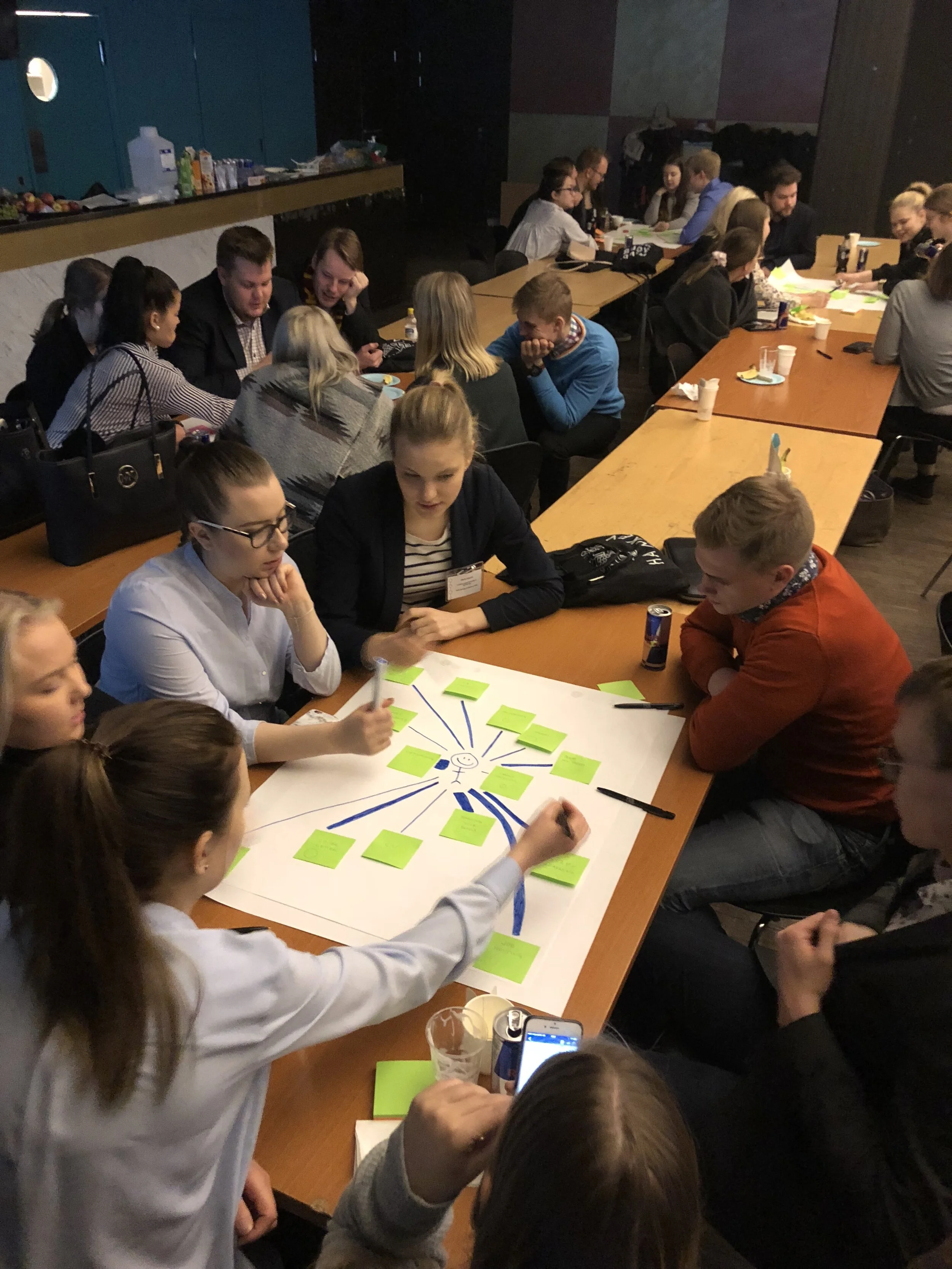
Business students co-creating activityscape maps - photo by me

Activityscape map from a recruiter’s POV - photo by me
Example of a customer activity map - from my thesis
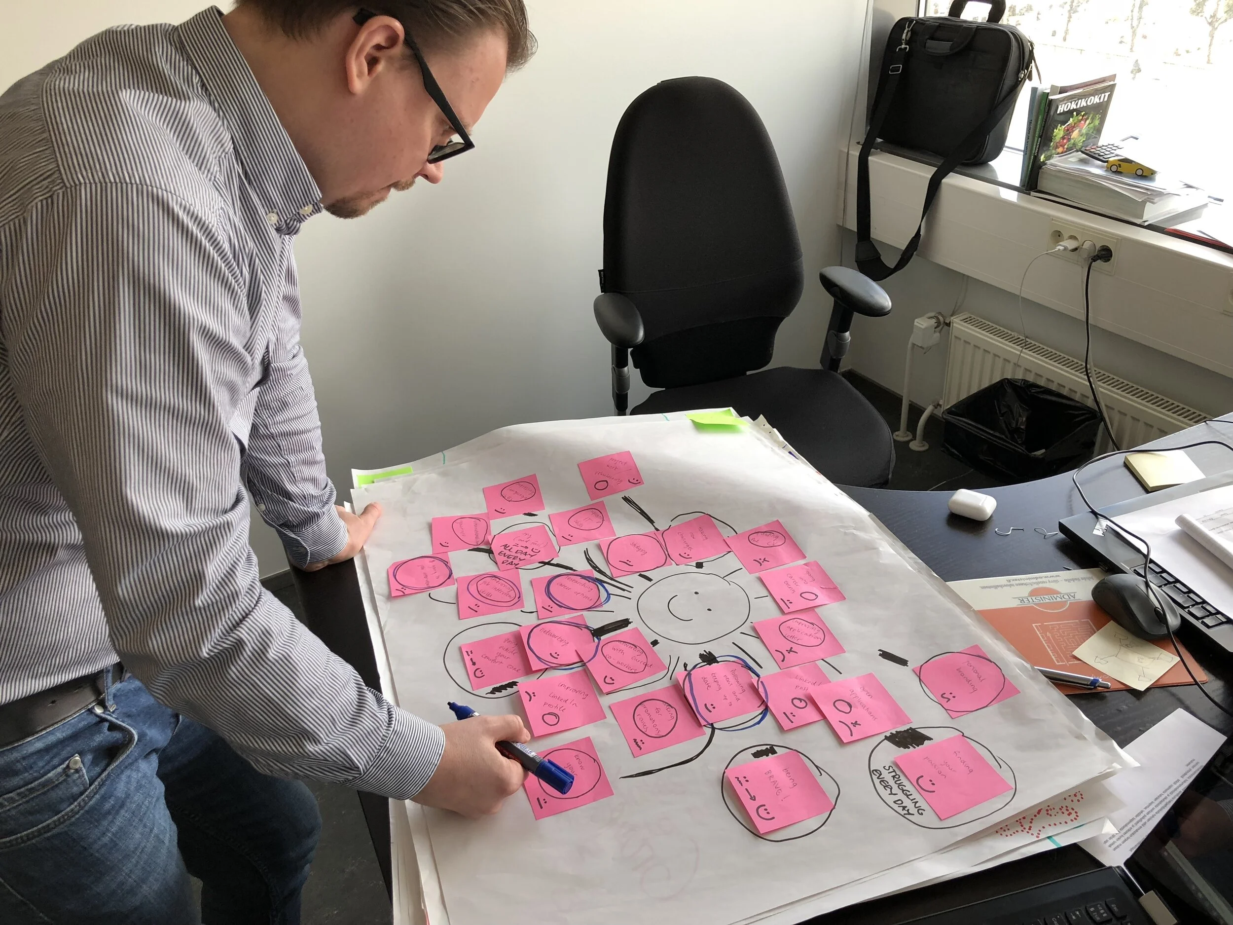
Analysis of workshop outputs - photo by me

Final synthesis of 8 activityscape maps. Activities to support with Pockethunt 2.0 highlighted - Created in cooperation with Joakim Honkasalo
Ideation phase
We now had identified some central themes and functionalities we wanted to include in the new app. Next up was the ideation phase, where each team member spent a short time creating quick sketches for an app that supports the functionalities outlined by the research. We then presented the sketches and voted on the ones we thought had most potential.

Sketches of app concept ideas - photo by me
Prototyping phase
For the final phase, we teamed up with Futurice to develop a prototype and an alpha version of Pockethunt 2.0. I worked together with Futurice service designer Toni Tiainen on the early blueprinting and with Numan Shakil on UI/visual designs. I learned a lot from both of them. My main responsibility in this phase was the production and validation of wireframes.
Wireframes were made into a functioning prototype and validated with 8 potential users at Futurice’s Tampere offices in June of 2018. Together with Toni Tiainen, we first interviewed the respondents and walked through the wireframe prototype to collect their feedback.
Around this time I also got promoted to the position of Product Design & UX Lead. My responsibilities in the company now included the entire design process of new features from research/feedback to development.
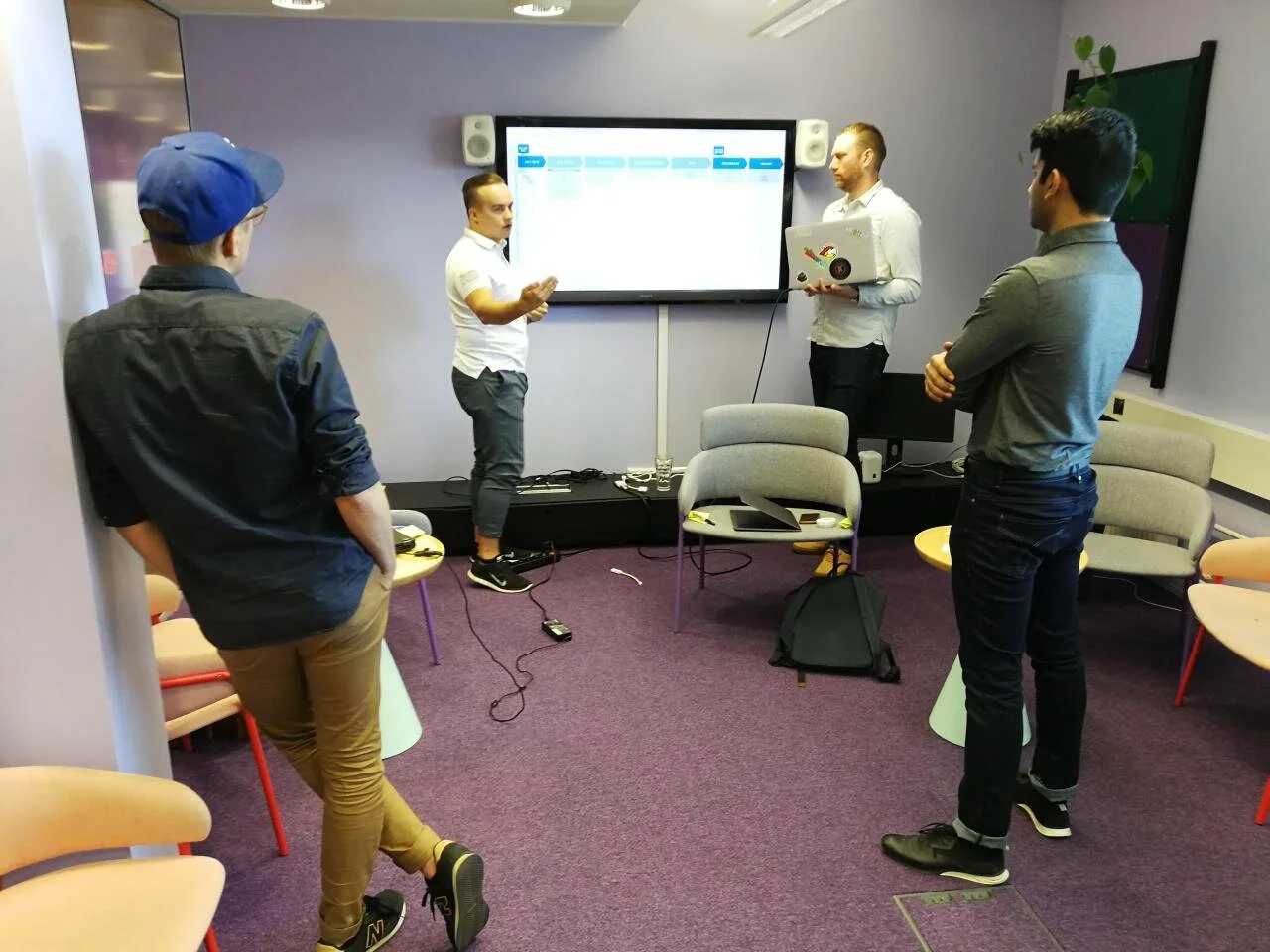
Discussing the user journey with Toni, Numan and Saku - photo by Joakim Honkasalo
Final iteration blueprint of Pockethunt 2.0 - created in cooperation with Toni Tiainen
Some early wireframes based on blueprint and sketches - created by me
Final result of the redesign process
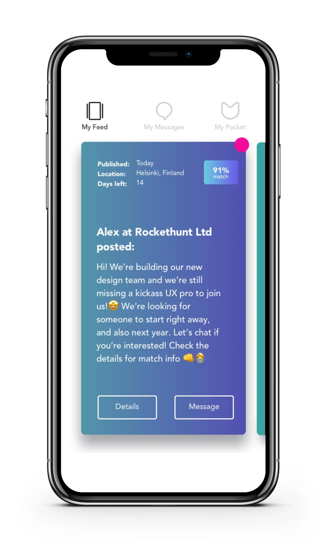
UI of Pockethunt 2.0 alpha - visual design by Saku Pönkänen/Numan Shakil

Promo image with slogan - slogan idea by me, visuals by Saku Pönkänen
Finally, after our co-operation with Futurice, Pockethunt 2.0 alpha was released. We conducted alpha testing and surveys with early-access users to further develop and validate the product.
Development of new features and fixes continued throughout 2019. My daily work involved managing our sprint boards and our backlog of upcoming features. Development tasks were prototyped and finalised in Sketch often in co-operation with our visual designer Saku, sometimes fully designed by me. Tasks were specced and documented in Asana, where we managed our sprints.
Website hero image on Pockethunt.com - design by Saku Pönkänen
Co-branding campaign with Columbia Road in March 2019
Pockethunt pirate funnel outlining user journey in relation to KPIs and team responsibilities - graphic made by me

In search of growth (2020)
Pockethunt is still looking to break through and find more investors. The COVID-19 pandemic slowed things down as budgets were cut significantly by investors. Even though progress is slow, we’re still working on experimenting and iterating to find a path to growth in a growth hacking fashion.
My responsibilities in 2020 included:
Defining roadmaps for feature development
Being an integral part in strategy planning with the CEO
Conducting and analysing interviews, surveys and testing with users
Wire-framing, prototyping and iterating new features in tight co-operation with developers including:
Monetisation
A redefined feed experience
Web UI for employers
Monetisation
The original plan for Pockethunt was to provide a free app both for talent and employers, grow to a critical mass, and later introduce paid features. In early 2020 however, we started planning for paid features as it turned out to be difficult to raise additional funding without any proof of viable monetisation.
I conducted a survey of our users to find out what specific existing and potential features they value and how much they would be willing to pay for them. We also consulted a monetisation expert on the matter. One main finding was that the users are interested in understanding how they compare with their peers professionally and in the job market.
Our first and latest experiment with paid features involved providing extra insights and data for talent users about their position in the job market. This premium insights package included, for example, calculations of “market value”, an annual salary based on the talent’s profile and the collective demand of employers in the app; salary comparison with peers; and skill set market demand.

Purchase and insights -screens - sketched and wire-framed by me, visual design by Saku Pönkänen
New feed experience
One of the central problems with Pockethunt at this point was a low onboarding rate and retention. Users had to create their profile before they could see any content made by employers and all content were based on job openings, making Pockethunt fail to stand out from competing apps sufficiently.
As a solution for this, I pushed for a big change in the Pockethunt experience. I suggested to let employers make general posts about their companies to be posted in the talents’ feeds instead of merely posting open positions. This would make Pockethunt more of a tool for employer branding for employers and at the same time increase the amount of interesting content in the talent feed.
We were also unhappy with the old sideways scrolling feed, which felt unnatural to use. We changed to a vertically scrolling feed inspired by other short-form video platforms such as TikTok and Instagram reels.
Finally, to improve the onboarding rate we decided to introduce a feature idea of mine that had been stuck in the backlog for a long time; the explore feed. The idea behind the explore-feed is that users can browse content in Pockethunt even before signing up with fewer features and no matchmaking.

Examples of content in the new feed format. Design by me and Saku Pönkänen
Web interface for employer users
The latest project I’m working on is creating a web interface for Pockethunt employer users. We recently conducted a series of interviews recruiters and talent acquisition managers in various startups and companies and found that they like to do most of their work on their laptops and thus only having a mobile app makes Pockethunt unfit as a part of their day-to-day workflow. Thus, we started designing a desktop web platform for employer users to create and manage their posts.
For me, the project involved making a designing a responsive web page - something I hadn’t done before as my focus had been on mobile apps thus far. I took inspiration from Instagram and other social media platforms to see how they have created a web version of a mobile-first app. The web UI had to be familiar to our existing app, but at the same time be responsive and utilise the larger available area on desktops. I feel like I succeeded well in this task and this was definitely one of my favourite projects so far.
Wire-frames for the web UI - by me
Final visuals for the web UI - visual finish by Saku Pönkänen

New UI components for web - designed by me

User journey blueprint for web UI - designed by me
Concluding thoughts
The amount of new skills and know-how I’ve learned during my four-year journey at Pockethunt is remarkable considering the relatively short time frame I’ve worked with design. Jumping straight into the deep end with no formal design education, I decided to start pursuing a service/product design career and ended up designing and launching a real product from scratch. I’m incredibly thankful for Pockethunt and especially its founder Joakim who gave me lots of responsibility and freedom to grow professionally. The work with Pockethunt is still ongoing and we have not yet seen the great success breakthrough every startup hopes to reach.
-
(update 2020) Pockethunt is no longer in business :(
User ratings (November 2020): App store: 4,5 - Google Play: 4,4
Downloads > 30 000