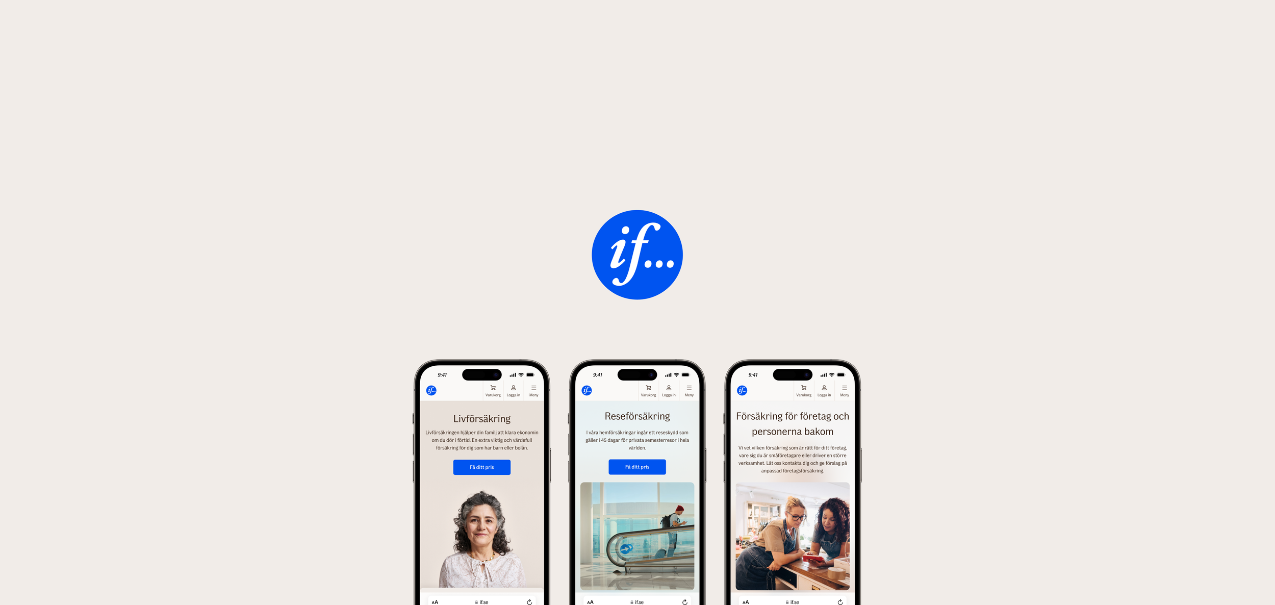
Since 2022, I’ve worked at If Insurance as a Senior UX Designer and UX Design Lead. If is the leading Nordic insurance company with 4 million customers.
My current role involves leading a 4-person design team that supports all Nordic e-commerce teams at If. I work closely with product owners, e-com managers, content managers and CRO specialists to develop and optimise If’s online sales channels for millions of visitors.
Here’s some of my favourite projects from my time at If so far.
New insurance product page concept
-
If has hudreds of different insurance products across multiple countries and business areas. Their product pages are one of the most visited and most important channels for the company with millions of visitors.
There was a lack of vision and guidance for how to build product pages that support what the customers are looking for. Most pages were overwhelming and complex walls of text and it’s difficult to find the right information.
-
Lead UX Designer. Participated in discovery sprint, concept co-creation and testing, design of finalised UI components and content blocks, implementation and iteration in collaboration with content managers, products owners and SEO specialists.
-
This has been the biggest initiative i’ve been part of so far. My main learnings include navigating the complexity of creating a website concept that someone else (content managers, mostly), will bring to life in hundreds of variants.
Taking into account both internal stakeholders’ and our customers’ needs and creating a concept that has a red thread all the way from customer insights to UI elements with enough flexibility to support local needs, and finally, communicating that concept and vision forward.
This project has also taught me to be even more humble in my expertise and to collaborate openly with different stakeholders.
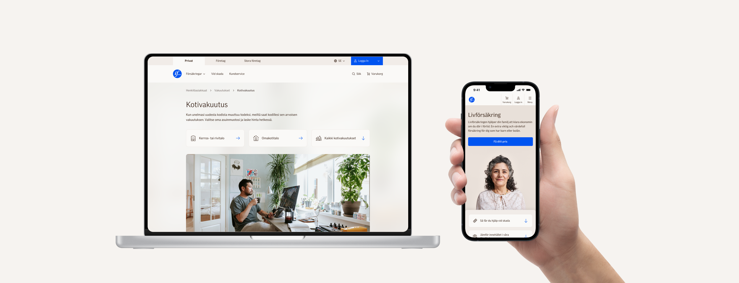
The product page concept was a 1-year long project that embodied the double diamond design process. Starting all the way from foundational customer discovery research, through iterative concept prototyping and testing, to continuous implementation to hundreds of insurance products in multiple countries.
For me, the most important thing was to always keep the red thread and connecting the dots in everything in between research and the final UI elements. The result is a product page concept that is truly customer-centric, because it’s fundamentally based on real customer pain points in buying insurance online.

Example of customer journey map for buying car insurance online

Main customer pain points related to buying insurance

Making customer pain points actionable with UX drivers. These would be the basis for ideation of page sections and their UI elements.

Creating a concept for product pages was a more complicated process than can be shown in an image, but we started on a high level and slowly iterated towards more concrete examples.
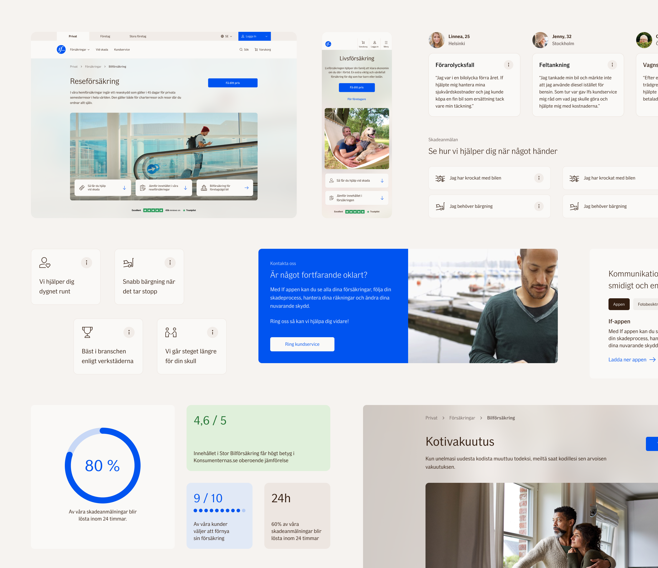
Some new UI elements created to support the new product pages. These also formed the direction for some updates for the If Design System later on. All designed by me with support from other fellow designers.
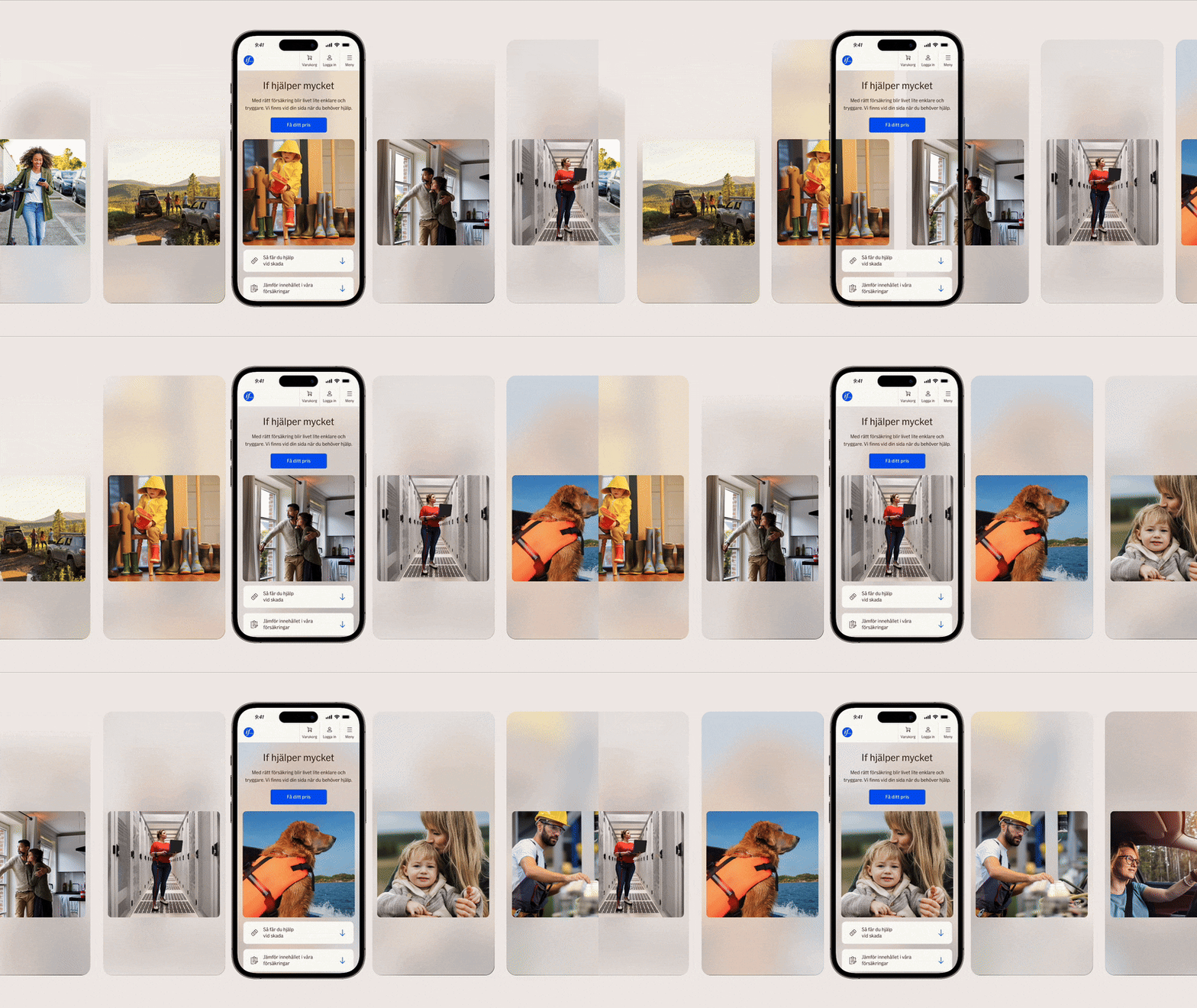
One goal of the new product page concept was to make a strong emotional impression when the customer lands on it. Since full screen imagery with text on top comes with a wide range of accessibility issues, we decided to go with this glass effect that reflects the colors of the chosen hero image in the background.
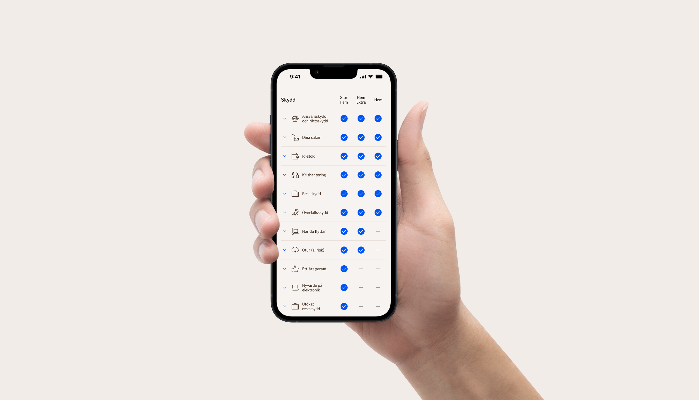
Mobile first product comparison table
-
The product comparison table is one of the most used and viewed elements on If’s web pages. It’s used both on the product pages and inside the webshops to show different coverage alternatives and pricing. The old designs were not optimised for mobile use at all though.
One challenge with creating a mobile-first comparison table is making complicated insurance products easy to compare at a glance. As with the product pages, the comparison table needed to also be flexible enough to support hundreds of products in multiple markets.
-
Lead UX Designer with two other designers as support. Understanding stakeholder needs, exploring different concepts, testing those concepts with users, iterating and implementing the new design.
-
You’d think designing a comparison table is relatively simple? It’s not! Balancing the needed flexibility of multiple languages and product structures while still keeping it always easy to use on small screens was not easy. This project was an interesting challenge in both mobile design and stakeholder management.

Different explored variants of the "open pages" matrix, meaning a comparison table used on product pages.
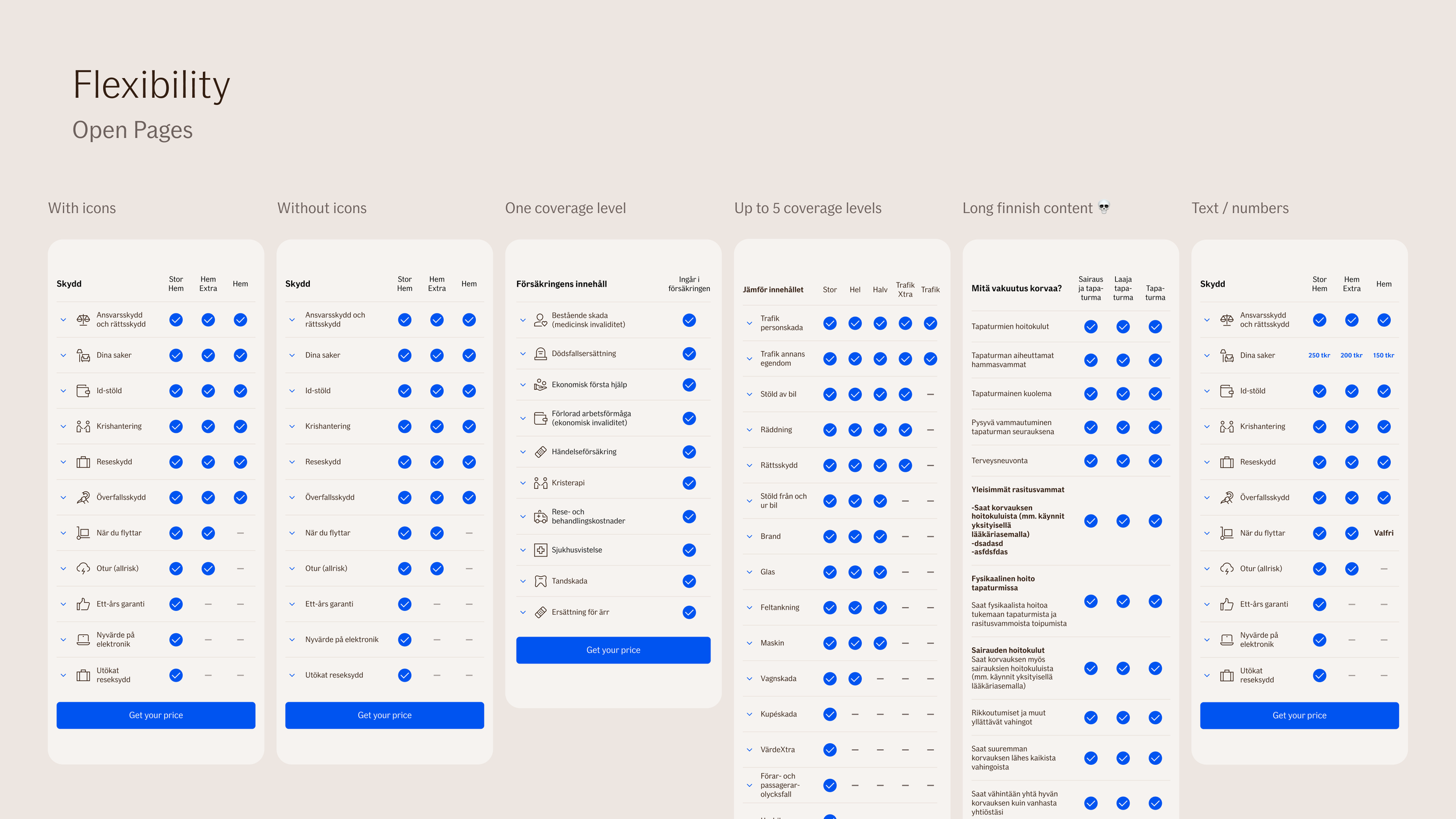
Flexibility was an important consideration for the design, since it had to support multiple markets and hundreds of products. Some had only one coverage option, while some had up to five columns. Different lengths of copywriting had to also be supported
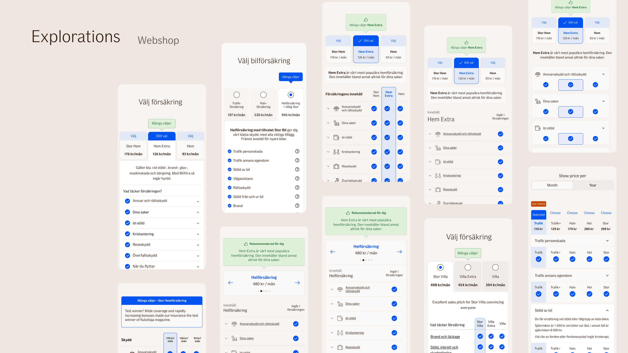
Different explored variations of the web shop product matrix. This comparison table also had coverage selection and pricing included, which made it different from the other type.

Again, flexibility was important to get right.
A couple more things…
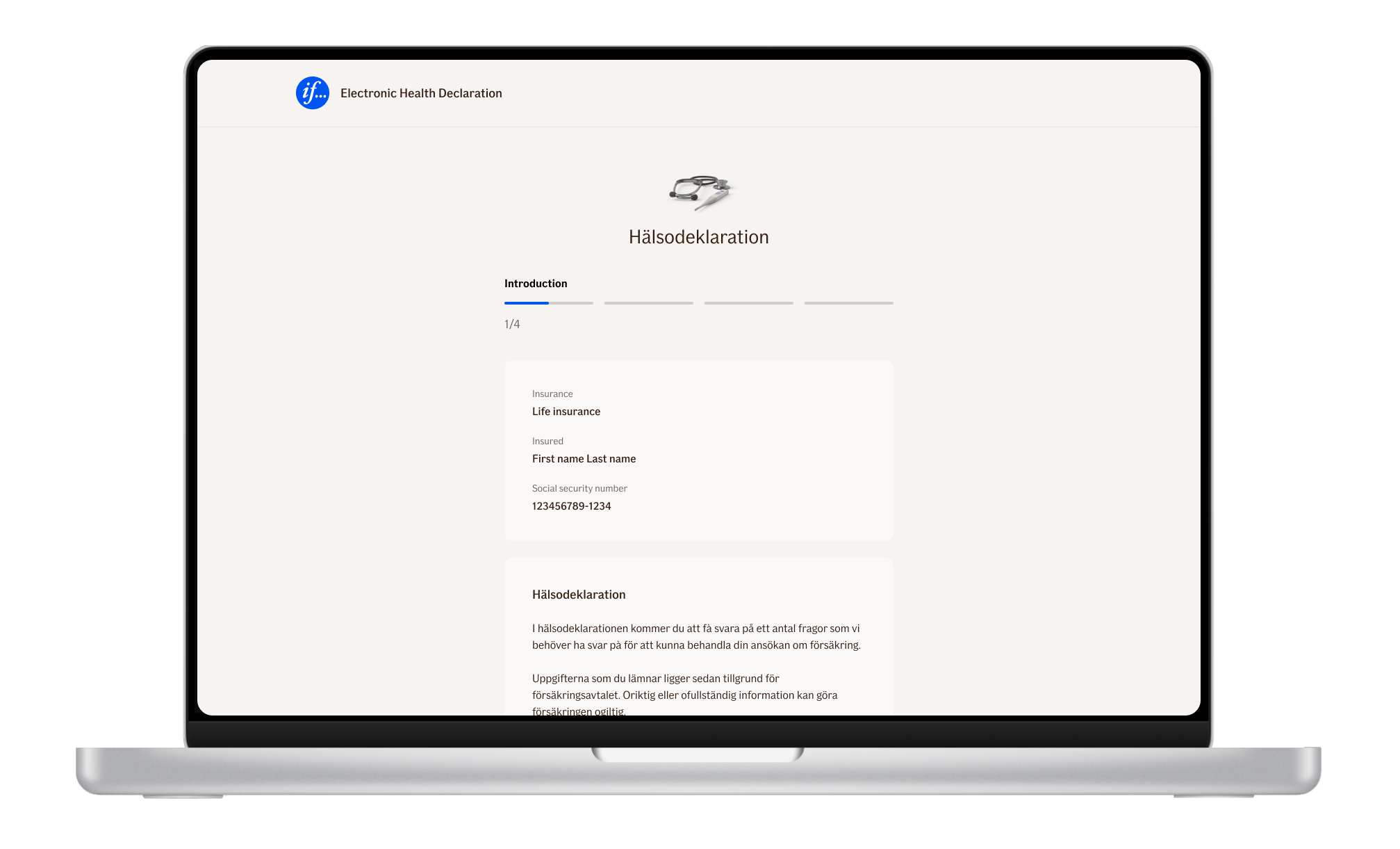
Redesigned health declaration flow
In-person usability testing

Usability testing new product page
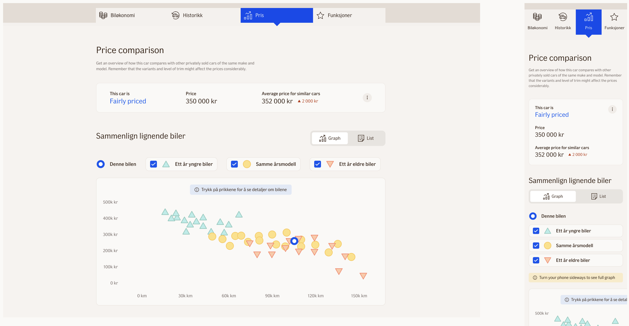
Price comparison graph for searching used cars in If's Norwegian Bilhjelpen service. Special focus on making an accessible graph.
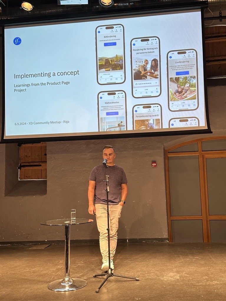
Presenting learnings in the Design Community Meetup in Riga
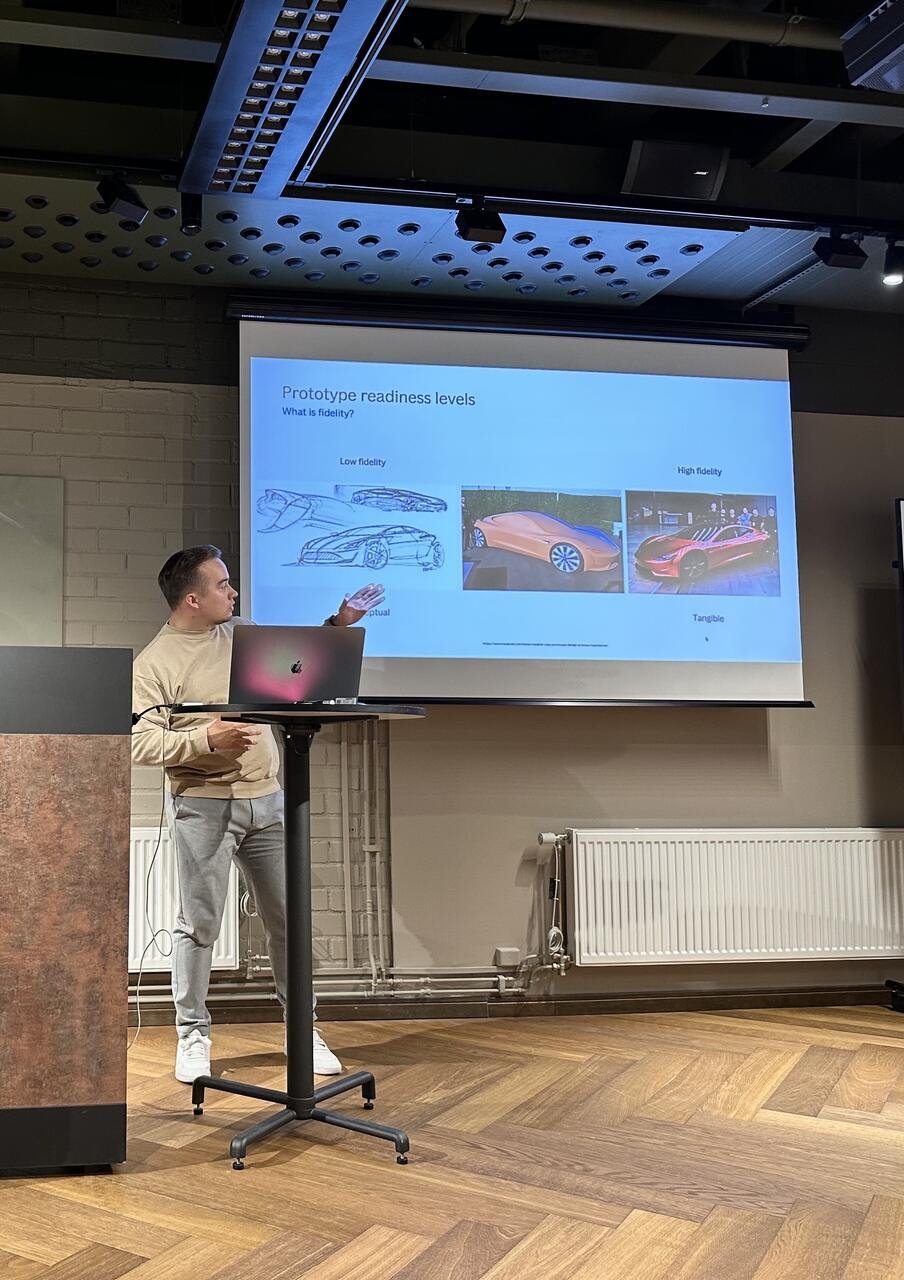
Presenting and facilitating at If's Customer Centricity Bootcamp
